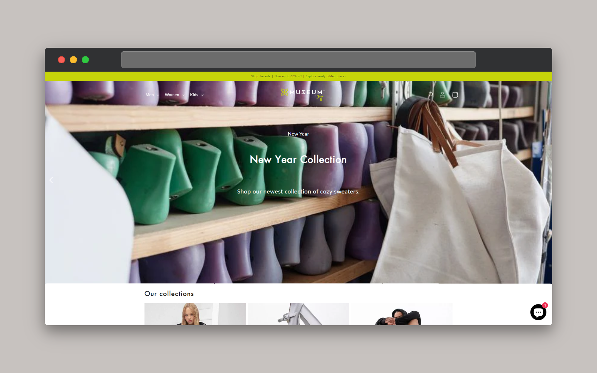
See in action
Website. Password is 1.
Designing a Shopify theme involves creating a visually appealing, highly functional, and easy-to-navigate interface that reflects the brand’s identity while providing a seamless shopping experience for customers. For this project, the theme is tailored to an e-commerce store that prioritizes both aesthetics and usability, using a modern, minimalistic approach.
When designing a theme, we should keep in mind one important thing:
A theme should be customizable as possible, but without overwhelming the theme settings.
Home Page
The home page is the storefront’s first impression, so it’s designed to captivate visitors immediately. A full-width hero banner sits at the top, featuring high-quality images or videos that highlight the brand’s flagship products or current promotions. Below the banner, strategically placed call-to-action buttons lead to best-selling products, new arrivals, or seasonal collections.
The layout is clean and spacious, with plenty of white space to ensure the content remains the focal point. The color palette is muted, using soft tones that complement the brand’s identity without overwhelming the viewer. Typography is carefully selected, using a modern sans-serif font that is both legible and stylish, contributing to the overall sleek and contemporary feel of the site.
Product Pages
Product pages are designed to be visually driven, with large, detailed images that showcase the product from multiple angles. The images are accompanied by a zoom feature, allowing customers to examine the product closely. Key details, such as price, availability, and options for size or color, are prominently displayed next to the images.
Below the fold, the product description is well-organized, breaking down features, materials, and care instructions into easily digestible sections. Customer reviews are integrated with a star-rating system, offering social proof and helping potential buyers make informed decisions. The “Add to Cart” button is designed to be highly visible and encourages quick purchasing decisions.
Collection Pages
The collection pages offer a well-organized grid layout, allowing customers to browse through products easily. Filters and sorting options are placed on the left side, enabling users to narrow down their search by categories, price range, color, or size. Each product thumbnail includes a quick view option, which provides essential details without taking the user away from the collection page.
The design of the collection pages ensures that even large inventories can be navigated effortlessly. Hover effects are used subtly to indicate interactivity, such as highlighting a product image when the mouse hovers over it.
Cart and Checkout
The cart page is designed with clarity in mind, listing all selected products, quantities, and subtotal prices in a straightforward manner. Customers can easily update quantities or remove items without hassle. The checkout process is simplified into a few steps, with progress indicators at the top of the page, guiding users through billing, shipping, and payment details.
To minimize cart abandonment, the theme includes a persistent mini-cart accessible from any page, allowing customers to view their selected items at a glance and proceed to checkout with one click.
Blog and Content Pages
In addition to product pages, the theme includes a blog section, which is designed to engage customers with content that complements the products. The blog layout is clean and focused on readability, using large, readable fonts, and well-spaced paragraphs. Images and videos are used effectively to break up text and add visual interest.
Content pages, such as the About Us and Contact pages, are designed to tell the brand’s story and build trust with customers. These pages use a combination of images, text, and even testimonials to convey the brand’s values, history, and mission. The design is consistent with the rest of the site, ensuring a cohesive experience.
Mobile Responsiveness
Given the importance of mobile shopping, the theme is fully responsive, ensuring a seamless experience across all devices. On mobile, the navigation is simplified into a hamburger menu, and touch-friendly elements are used throughout. The design ensures that images, text, and buttons scale appropriately, maintaining usability without sacrificing aesthetics.
Recently Viewed
The "Recently Viewed Products" section in Shopify is a feature often used in online stores to enhance the shopping experience and potentially increase sales. This section displays products that a customer has recently looked at on the website.
Final Details
The theme is optimized for speed and performance, ensuring fast load times, which is critical for both user experience and SEO. Additionally, the theme is designed to be customizable, allowing the brand to easily update content, change colors, and adjust layouts as needed, all without requiring extensive coding knowledge.
This Shopify theme design not only creates an inviting and efficient shopping environment but also reinforces the brand’s identity at every touchpoint, making it a powerful tool for driving online sales.
